ZING Dim Sum Restaurant
A visual identity for a contemporary dim sum restaurant focused on bringing the spirit of Hong Kong’s golden era into an experience that fuses tradition and modernity.
“Zing” comes from the Cantonese word “蒸” meaning “to steam”—an essential method in the mastery of dim sum—and speaks to the English meaning of the word: lively, bold, and full of energy.
Each dish is crafted with the same care and authenticity found in a Cantonese tea house, yet reimagined with flavors that feel both familiar and fresh. Like Hong Kong itself, Zing is a vibrant fusion of dim sum, bridging generations of recipes with contemporary tastes.
Year
2024
Role
Brand Design, Art Direction, Photography
Custom Logo Design
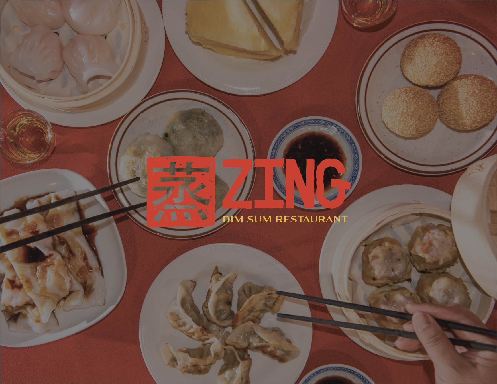
The primary logo draws inspiration from Chinese seals, typically used as signatures with a distinct pattern unique to each person. Paired with a bold, custom-made font inspired by ink bleeds, the logo combines tradition and modernity.
The secondary logo features the same elements using the brand’s bold colors to capture a contemporary twist on cultural heritage.


Color Palette and Typography
ZING’s color palette is inspired by aspects of Chinese culture and the specific meanings of each color. The colors represent the Chinese values that ZING embodies.
The primary typeface, RUSTIQUE, is inspired by vintage stamps and retro labels. Its rough edges mimic bleeding ink or rusted metal for a distressed, lived-in look.
The secondary typeface, Acme Gothic Extra, is based on the thick-and-thin gothic lettering style popular in the U.S. in the first half of the 20th century.
Responsive Logo System
Branded Assets


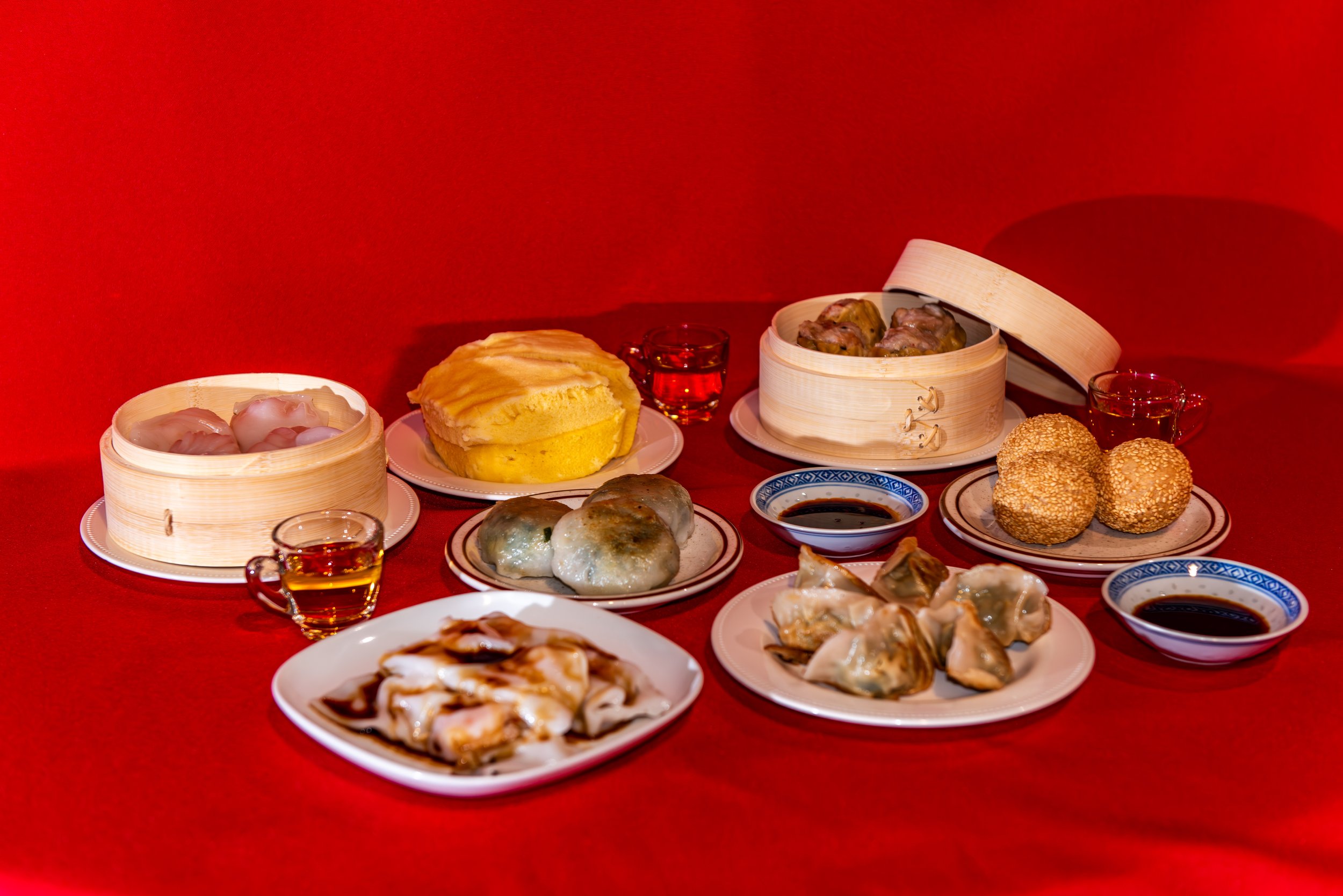
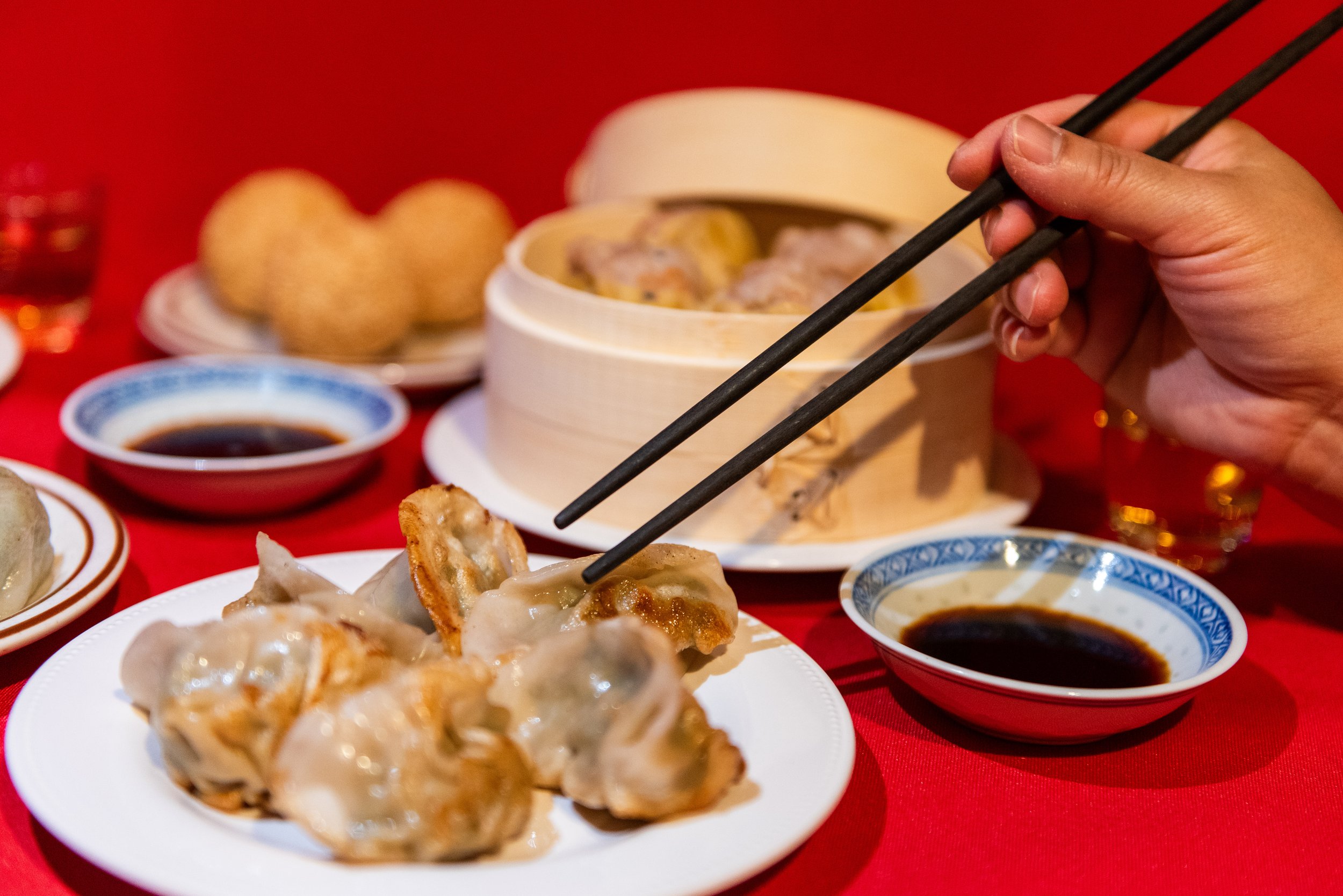
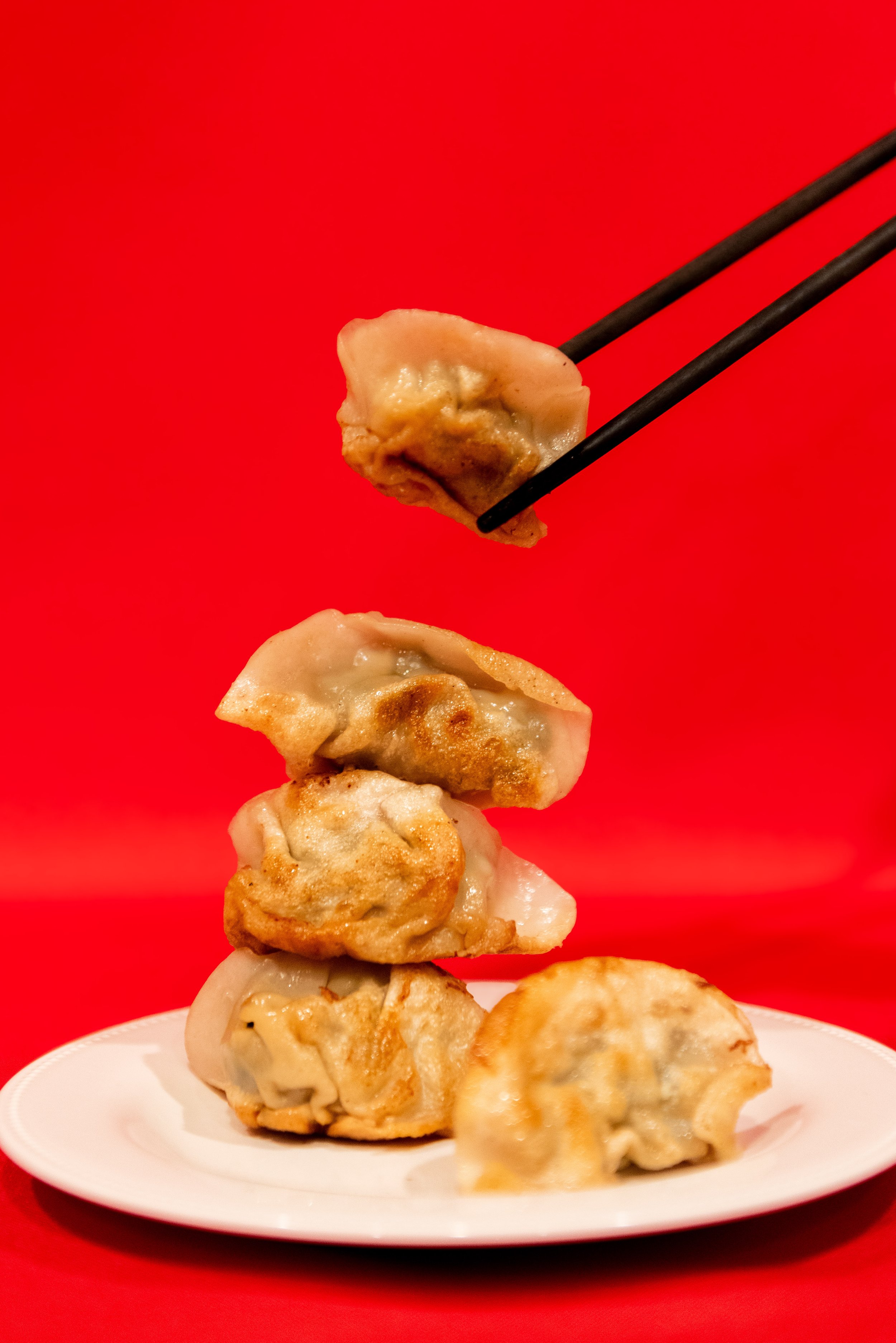
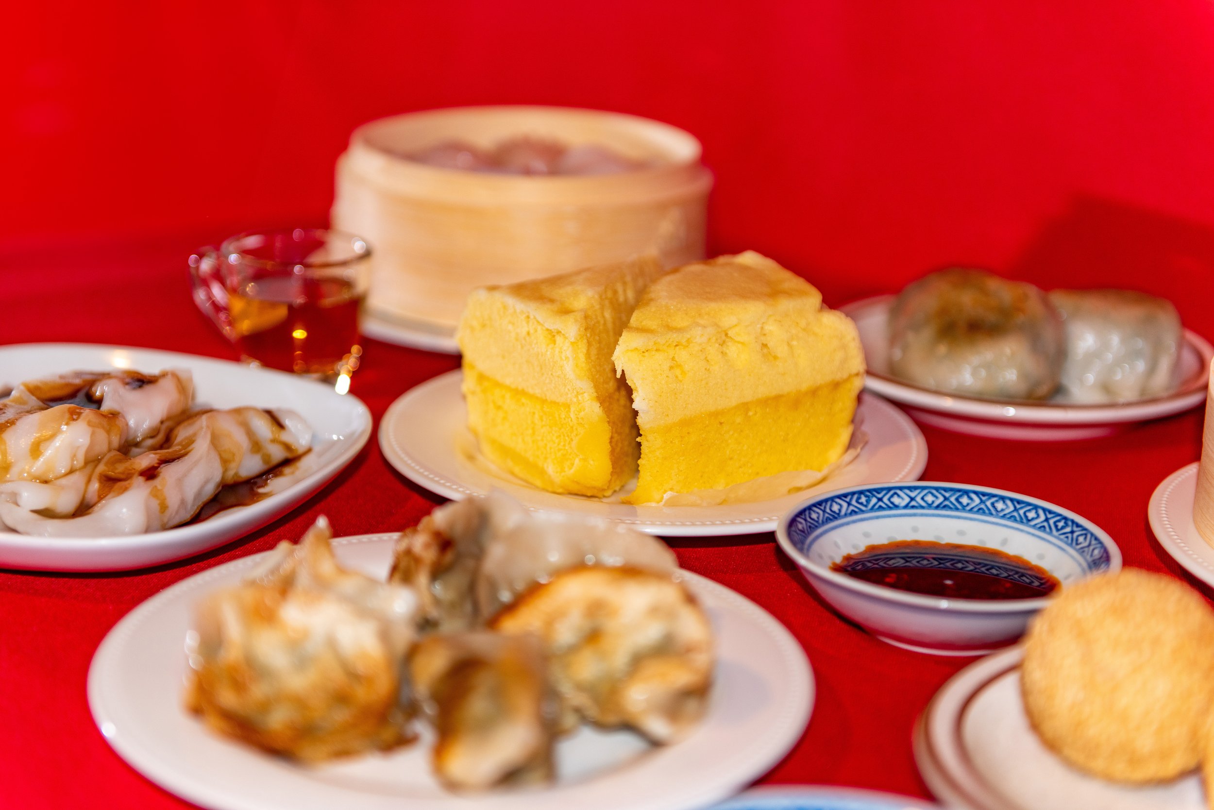
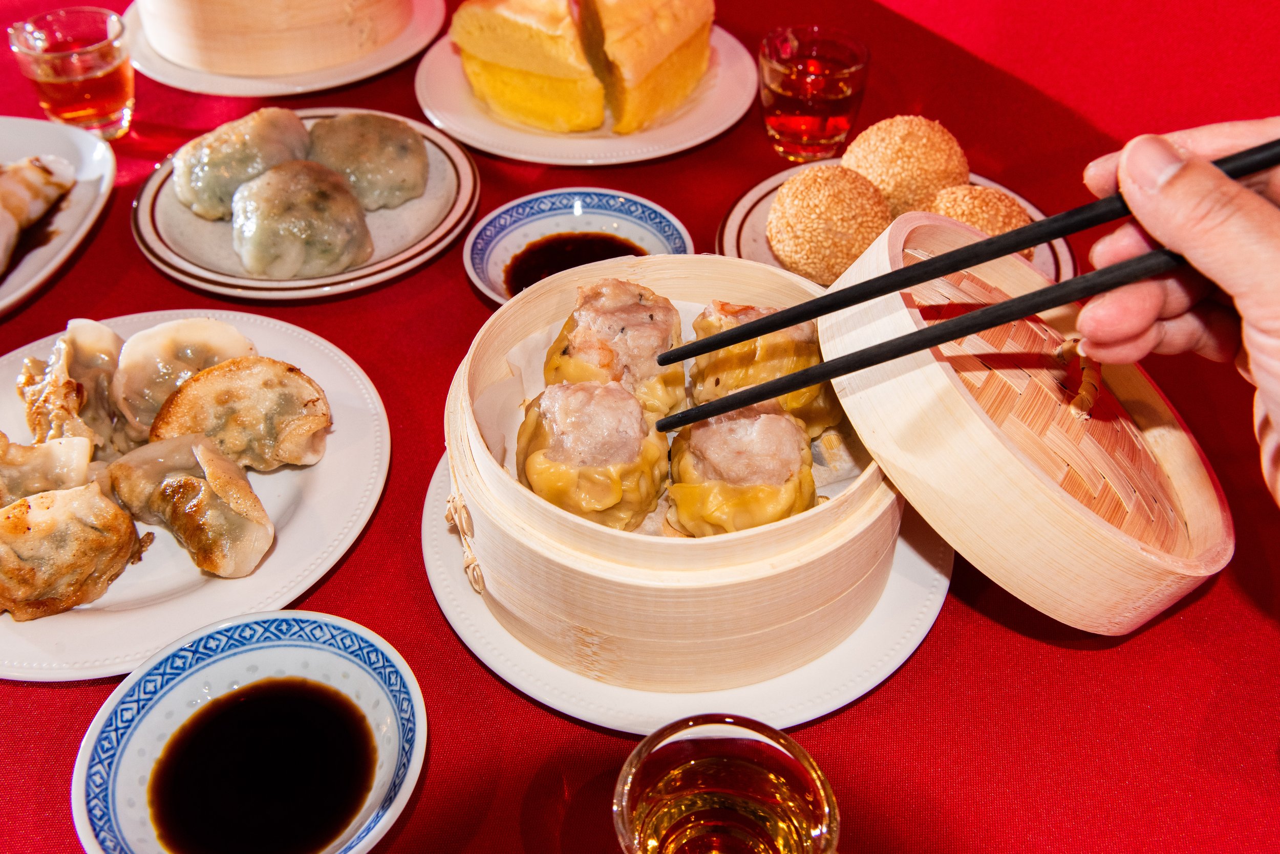
Original Brand Photography
Shot by Laurie Vuong