SunBud
A visual identity for a gender-inclusive sunscreen brand that de-stigmatizes skincare and focuses on making sun protection accessible and easy to apply.
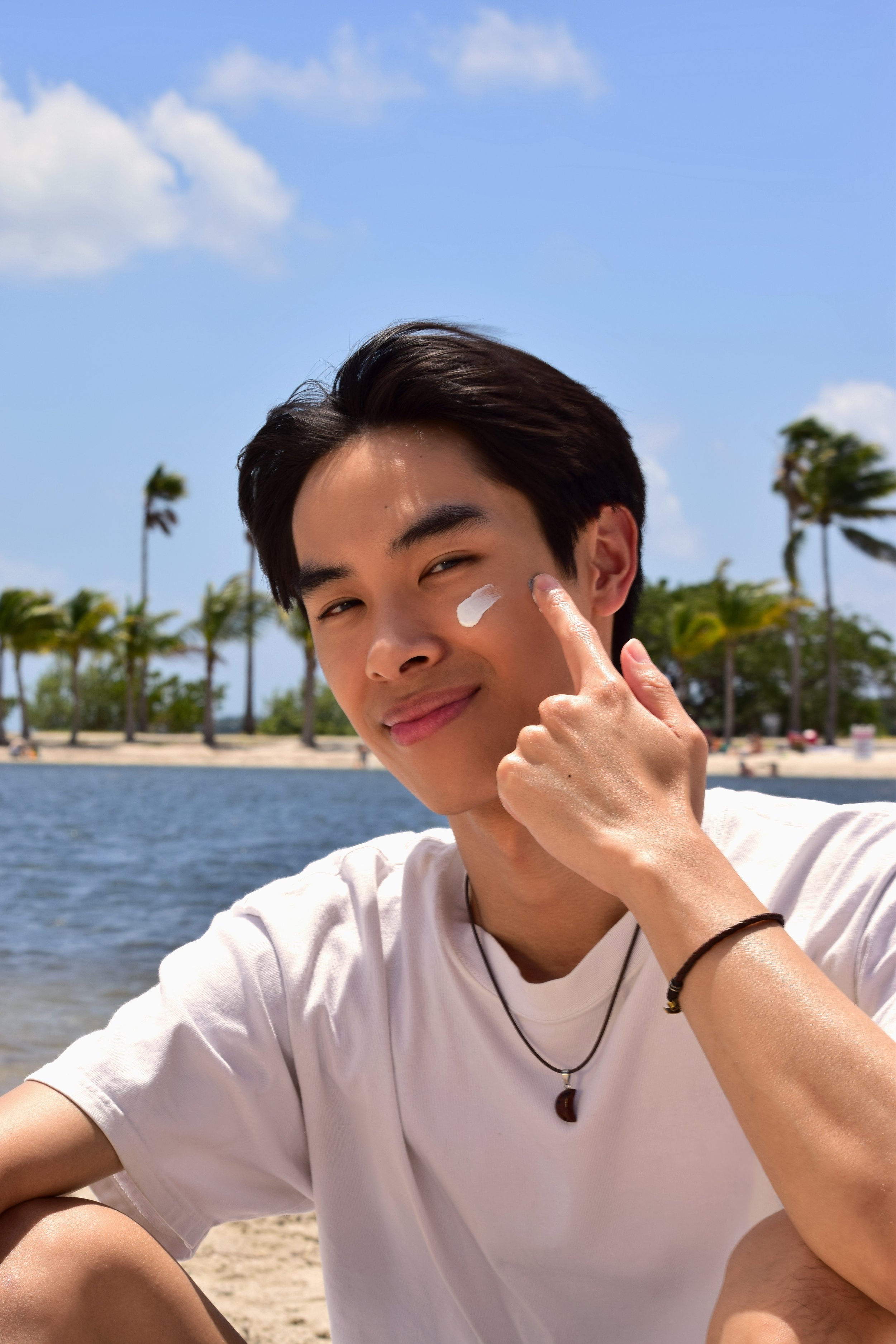
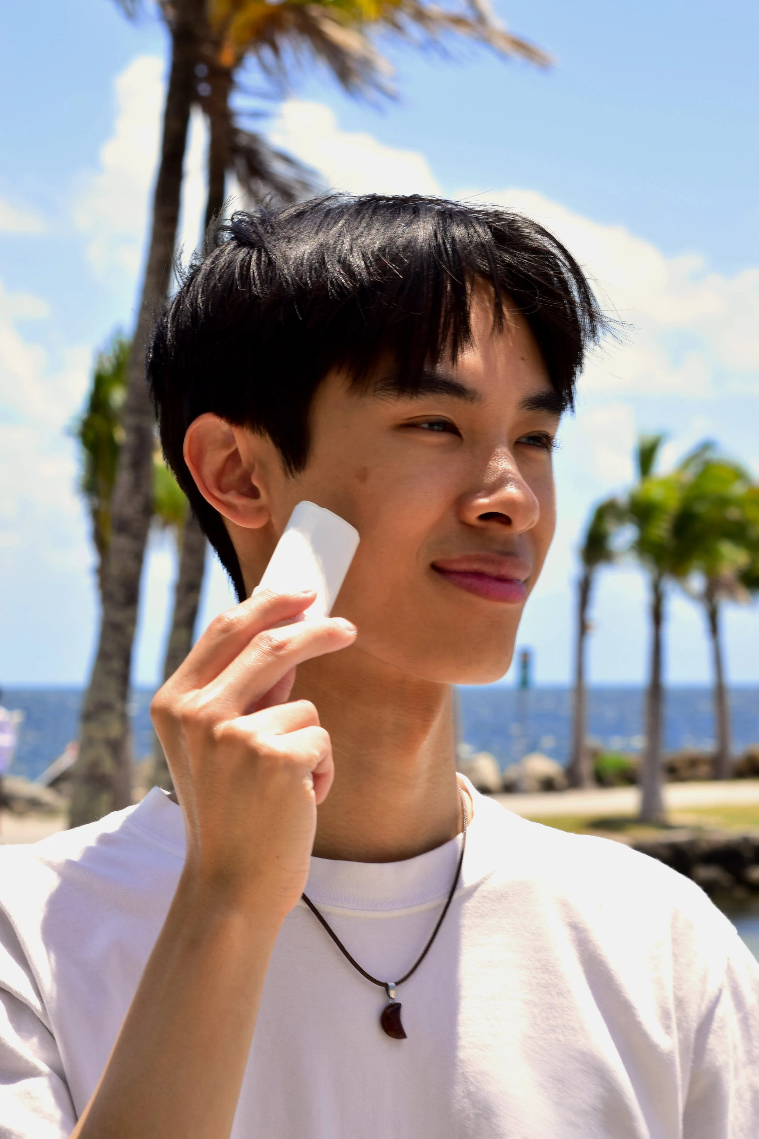
SunBud is sunscreen made for people who spend time outside, whether it’s part of the plan or just part of life. It’s not about routines or trends. It’s about protection that works without getting in the way. Just simple, effective defense that fits into your day and keeps you covered. Because taking care of your skin isn’t complicated. It’s just common sense.
Year
2025
Role
Brand Design, Art Direction, Photography

Custom Logo Design
SunBud’s logo features symmetrically stacked letters in a bold, blocky font with sun rays beaming out. The logo accentuates the brand’s boldness and confidence in providing sun protection for all.
The logo has the ability to take on a horizontal variation by unstacking the letters. The horizontal version can include the sun rays, or stand just as a wordmark.
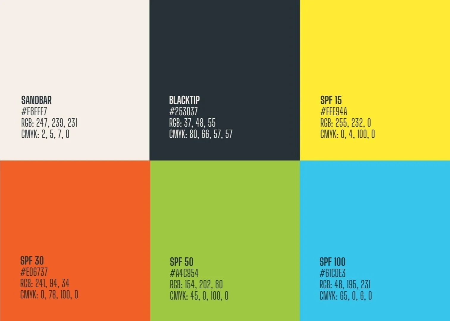
Color Palette & Typography
SunBud’s color palette centers on a dark, neutral base that feels solid and masculine, while the brighter accent colors provide a sharp contrast, bringing in a sense of energy and the outdoors.
Wosker Regular is used for the brand’s logo and as a primary typeface. The thick, blocky letters exudes confidence with no frills.
Big Shoulders Display is used as the secondary typeface. Its condensed, tall letters add visual contrast to the primary typeface.

Icons & Graphic Elements
The custom sun icon is used throughout SunBud’s branding as a supplement to the logo. Stripes in the brand colors are also used as graphic elements throughout the branding.
Branded Assets


Out-of-Home Ads


Social Media


Original Brand Photography